Exploring the Switch from Cantarell to Inter
GNOME’s Font Evolution
August 2024
PC Boss
A New Era with Inter
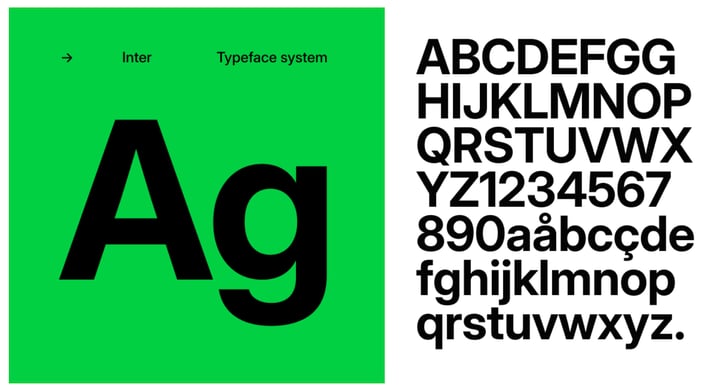
Inter, an open-source sans-serif typeface created by Swedish programmer Rasmus Andersson in 2017, is being tested as a potential replacement for Cantarell. Designed specifically for computer screens, Inter boasts exceptional legibility, versatility, and adaptability, making it a strong candidate for the GNOME desktop.
Why Inter?
Inter offers several advantages that make it an appealing choice for GNOME:
Legibility: Inter is crafted with a large x-height, improving readability, especially in smaller font sizes commonly used in user interfaces.
Variability: With multiple weights and styles, Inter is highly customizable, allowing for more flexibility in design.
OpenType Features: Inter includes advanced typographic features, which can enhance the overall user experience.
Glyph Coverage: Supporting 147 languages, Inter’s extensive glyph set ensures that it can cater to a diverse user base.
Why Change from Cantarell?
Cantarell has been the default font for GNOME since around 2010, providing a reliable and recognizable visual identity. However, several factors have prompted the GNOME design team to consider a switch:
Modernization: As technology advances, so do the demands on typefaces. Modern fonts like Inter are designed with contemporary user interface needs in mind, offering better support for new features and design trends.
Maintenance: One of the key reasons for exploring a new default font is the lack of active maintenance for Cantarell. In contrast, Inter has a vibrant, active community that continually updates and improves the font, ensuring it remains relevant and functional.
Consistency Across Platforms: While some GNOME-based distributions like Fedora Workstation use Cantarell, others, like Ubuntu and Pop!_OS, opt for different typefaces. A more universally recognized and maintained font like Inter could help standardize the visual experience across different distributions.
Cantarell vs. Inter
Design Focus
Cantarell: Designed as a general-purpose typeface, it provides a simple, clean look but lacks some of the advanced features found in newer fonts.
Inter: Specifically designed for user interfaces, Inter excels in legibility and versatility, making it better suited for modern desktop environments.
Maintenance
Cantarell: As noted by GNOME developers, Cantarell is “basically unmaintained,” which raises concerns about its long-term viability.
Inter: Actively maintained with a robust community, Inter is regularly updated, ensuring it keeps pace with evolving design requirements.
Language Support
Cantarell: While it supports a wide range of languages, its glyph coverage is more limited compared to Inter.
Inter: With coverage for 147 languages, Inter provides better support for a global user base.
How to Try Inter on GNOME
If you’re curious to see how Inter performs on your GNOME desktop, you don’t need to wait for GNOME 47. Here’s how you can try it out now:
Download Inter: Obtain the font from the official Inter website rather than Google Fonts to ensure you get the most up-to-date version.
Install the Font:
Extract the downloaded .zip file and open the resulting folder.
Double-click on InterVariable.ttf and click the install button in the Fonts app.
Repeat the process for InterVariable-Italic.ttf.
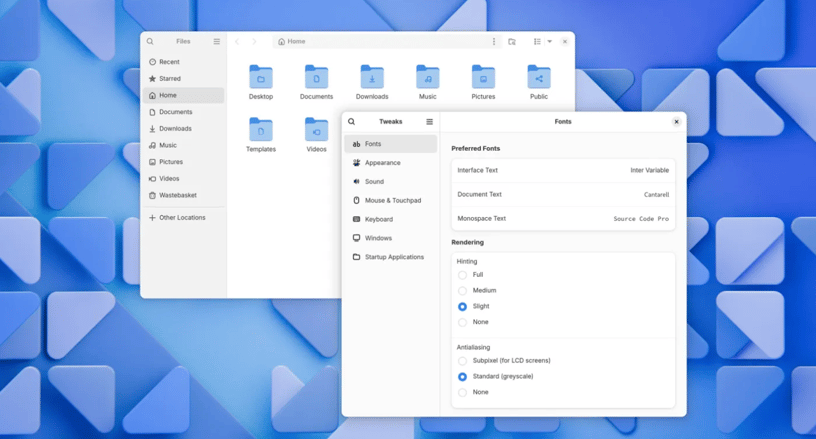
Set Inter as Your Interface Font:
Open GNOME Tweaks and navigate to the Fonts section to select Inter as your interface font.
Alternatively, use the command-line
gsettings set org.gnome.desktop.interface font-name 'Inter Variable 11'
GNOME developers are still experimenting with different sizes and weights, so the final look of Inter in GNOME 47 is yet to be determined. However, setting the font size to 11 should give you a good idea of what to expect.
Top 10 Q/A
What is Inter?
Inter is an open-source sans-serif typeface designed specifically for computer screens, known for its high legibility and versatility.
Why is GNOME considering switching to Inter?
GNOME is exploring Inter as a replacement for Cantarell due to its modern design, active maintenance, and better support for new font features.
What makes Inter different from Cantarell?
Inter is more adaptable with multiple weights and styles, includes advanced OpenType features, and supports a wider range of languages, making it better suited for modern UI needs.
Is the switch to Inter final?
No, GNOME is currently testing Inter. If it doesn’t meet expectations, the team may revert to Cantarell.
Can I try Inter on my GNOME desktop now?
Yes, you can download and install Inter from its official website and set it as your interface font using GNOME Tweaks or command-line.
How does Inter compare to other fonts used by GNOME-based distros?
While Ubuntu uses the Ubuntu font and Pop!_OS uses Fira Sans, Inter offers a more standardized and modern alternative that could unify the visual experience across distributions.
What are the potential drawbacks of switching to Inter?
As Inter is still being tested, there may be issues with font rendering or compatibility that need to be addressed before it becomes the default.
Will Inter affect the performance of my GNOME desktop?
No, switching to Inter should not impact the performance of your desktop environment.
How often is Inter updated?
Inter is actively maintained, with regular updates that include bug fixes, new features, and expanded language support.
Where can I learn more about Inter and its features?
You can visit the official Inter website to explore its features, download options, and documentation.
BOSS LEVEL TIP: Preparing for GNOME’s Font Evolution
To stay ahead of potential issues during this transition, regularly update your GNOME desktop and the Inter font if you choose to install it. Keeping your system up-to-date ensures you benefit from the latest fixes and enhancements. Additionally, be prepared for some trial and error as the GNOME team finalizes their decision on the default font. If you encounter issues, don’t hesitate to revert to Cantarell or explore other fonts until a stable release is confirmed. This proactive approach will ensure a smooth and visually appealing experience on your GNOME desktop.
For over a decade, Cantarell has been the visual cornerstone of the GNOME desktop environment, providing a consistent and recognizable typeface across the interface. However, as GNOME continues to evolve, so too must its design elements. The upcoming release of GNOME 47 might introduce a significant change—a new default font. While it’s not a brand-new font in the world of typography, it’s certainly new to GNOME: Inter.